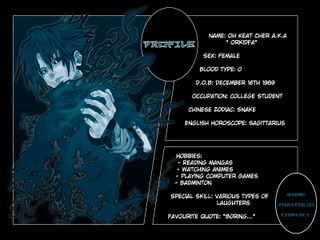
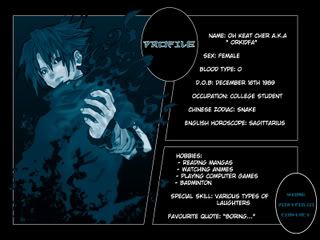
Here come's the Profile pages. XD
To Glow or Not To Glow Sasuke? That is the question. XD Which do you prefer?
Does it feel like you're reading an online manga? Any feedback you have on the navigation style? the Readibility? The text flow? Much thank yous again for helping me out here people. XD
Over and out
-ruzy-
Wednesday, October 29, 2008
Monday, October 27, 2008
ACK! *Choke* *Choke* *breathe*
Thousands of apologies for not keeping this blog up to date like the other one. (Don't give me that 'no-hope' look. -_-' I know I'm guilty of not updating the other one as well la.)
Anyway, time to get rid of the dust bunnies, kan? XD
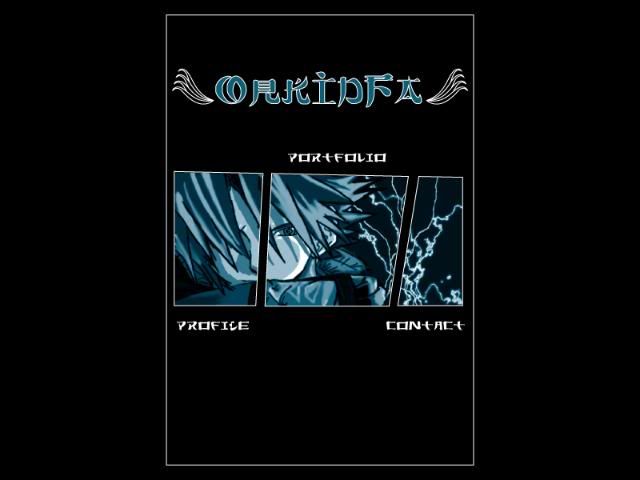
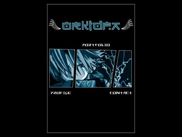
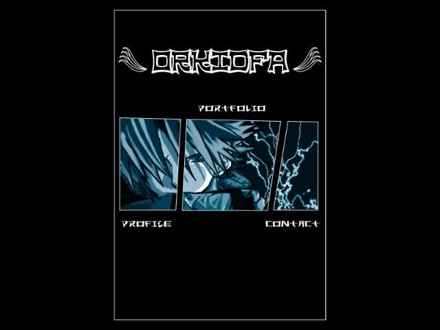
So, here I present to you...*Dusty drumroll* ORKIDFA! but NOT in the flesh! kekeke.
OrkidFa is created to represent the likes and characteristics of my client, Oh Keat Cher. By client, we mean a classmate la. The required art style? SIMPLICITY.
I chose to work with mainly 3 colours for the website; blue, black and white. It's the client's prefered colour as well as the colour of her favourite manga/anime character when he was first introduced into the series. Character: Uchiha Sasuke. The website was designed to look like an online manga.
Now, this is where I ask for you help. Please give comments, suggestions or feedbacks on the layout, typography, or ANYTHING at all regarding my design of the 'website'. Yeaps, it's suppose to be a website. One main page and 3 browsing pages. However, I will only be showing the main page for now. Okay? Much thank yous. *PS: Leave your comments at the comment section and the tagboard yea?*
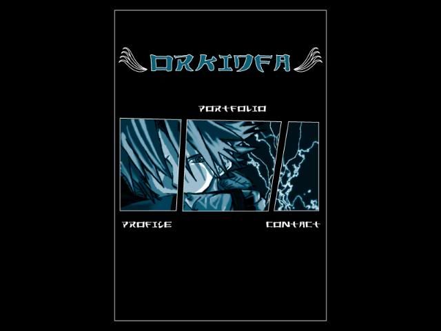
The difference between the images below is the image on the TOP has the layout on the enter page arranged higher compared to the one on the BOTTOM, which has a more centerised arrangement.
Rights, now for the typography. Which typeface do you prefer as the page TITLE? Do you think the typeface used as the links (profile, portfolio. contact) is suitable for the website? Does the typeface have a Japanese feel to it? (?_?)
Anyway, time to get rid of the dust bunnies, kan? XD
So, here I present to you...*Dusty drumroll* ORKIDFA! but NOT in the flesh! kekeke.
OrkidFa is created to represent the likes and characteristics of my client, Oh Keat Cher. By client, we mean a classmate la. The required art style? SIMPLICITY.
I chose to work with mainly 3 colours for the website; blue, black and white. It's the client's prefered colour as well as the colour of her favourite manga/anime character when he was first introduced into the series. Character: Uchiha Sasuke. The website was designed to look like an online manga.
Now, this is where I ask for you help. Please give comments, suggestions or feedbacks on the layout, typography, or ANYTHING at all regarding my design of the 'website'. Yeaps, it's suppose to be a website. One main page and 3 browsing pages. However, I will only be showing the main page for now. Okay? Much thank yous. *PS: Leave your comments at the comment section and the tagboard yea?*
The difference between the images below is the image on the TOP has the layout on the enter page arranged higher compared to the one on the BOTTOM, which has a more centerised arrangement.
Rights, now for the typography. Which typeface do you prefer as the page TITLE? Do you think the typeface used as the links (profile, portfolio. contact) is suitable for the website? Does the typeface have a Japanese feel to it? (?_?)
Subscribe to:
Posts (Atom)