The purpose of this project is to study justlife’s current website at www.justlifeshop.com, study its target audience and enhance their existing website’s interface. A proposal for a better site navigation is allowed. The task has to be completed in 7 weeks with a fully functional commercial website with no less than 8 HTML pages that shows at least 3 levels of content structure. The logo and identity of justlife are not to be altered in anyway. Repositioning of the brand is not permitted as well.
Current Site’s Analysis Goals
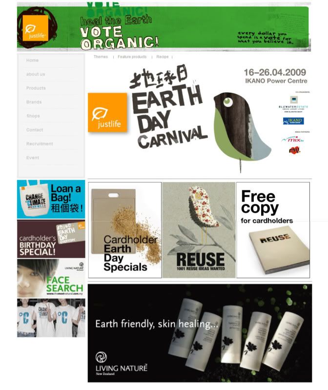
justlife’s website is catered to two language markets; English, being the primary market and Chinese, the secondary market. This website promotes organic products that are not only healthy but are also environment friendly. In addition, the website promotes an organic lifestyle with recipes that are healthy as well as events that will educate the public on how to lead a chemical-free lifestyle.
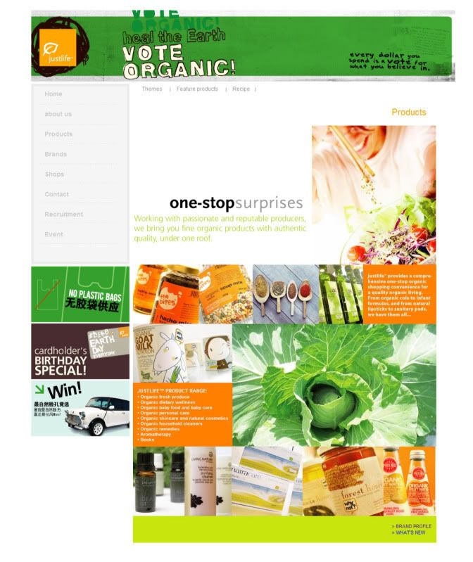
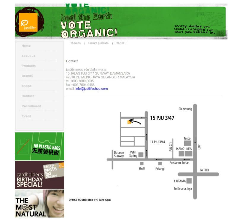
The web site could probably improve by separating into an English language section and a Chinese language section. This would benefit the Chinese reading users when they visit the website especially when they visit the ‘Brands’ page since that page in entirely in English and not bilingual like the ‘Recipe’ page. The ‘Products’ section could also be enhanced by arranging the products into categories that can expand into another section to provide users with more information on the products of their interest. Also, rather than waiting for an event to happen to educate the public on living an organic lifestyle, small information boxes around the website that provides information on healthy living and environmental messages would make the site more informative. The ‘Shops’ and ‘Contact’ section could merge into one section for easy navigation for the users.
Also, the banners on the website could be repaired. This is because when users hover their mouse cursor over the banner, the cursor would change into a hand cursor indicating that the banner can be clicked and will lead the users to another page, but in fact the current page that they are on will only be refreshed.
Client’s Analysis
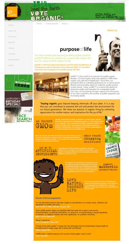
“Our retail concept goes beyond just selling organic products. justlife reflects our passion for a career that inspires the love for nature and respect for life.”
Quoted from justlife’s website.
justlife is the first approved organic retail franchise by Ministry of Entrepreneur ad Co-operative since February in 2005. It is founded and under the management of justlife group sdn bhd. justlife’s first organic shop started in 1999. Today, justlife is a name that stands for distinctive quality and inspiration for sustainable health. Each day, the numbers of justlife supporters are increasing rapidly.
justlife’s mission is to provide high quality organic products to the public at affordable prices and at the same time, protecting the planet for future generations by educating the public now to preserve their soil and environment. This can be seen when a customer goes into a justlife store, they are not encouraged to use plastics bags to carry their purchased goods, and instead they are advised to use a reusable cloth bag or carry.
Short and Long-term Site Goals
By giving detailed information on products, this would give confidence to potential customers because they would know what they are purchasing. And if the customers are satisfied with their purchase, they would come back again to purchase more items. At the same time, satisfied customers would promote this site to friends and family members. This would help generate more profits for justlife shops.
By providing and updating tips on how to preserve the soil and environment on the website, users will come back to the website for more information on how they can lead better lives and at the same time change the world for a better place. The users would also share the website with friends by word-of-mouth.
The website’s goal is to create brand loyalty by providing regular updates on environmental-friendly tips and events as well as product information.
Target Audience
The target audience for the website would be young adults from ages 17 to 29, followed by adults aged 30 to 55, who are the secondary target audience.
These would be people who are concerned about their health and environment and want to do something to make the planet a better place to live. These poeple would most likely be looking for organic products and/or tips to change their lifestlyes to a healthier one.
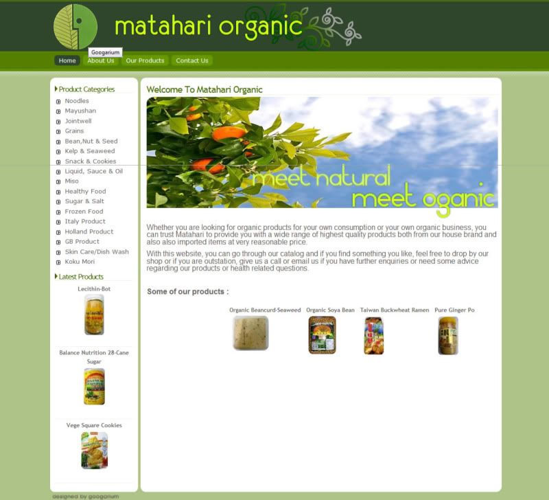
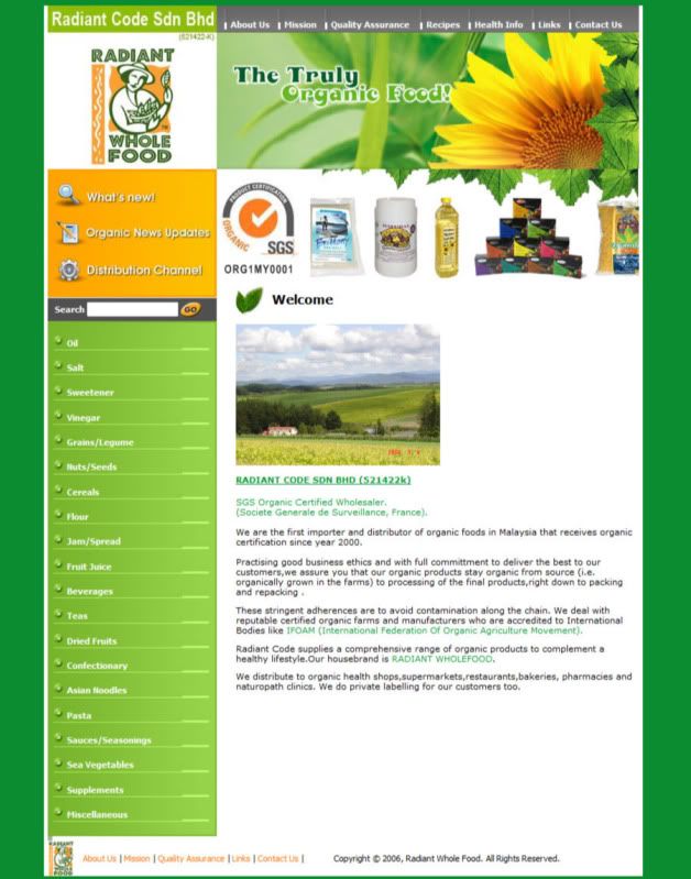
Competitors Analysis
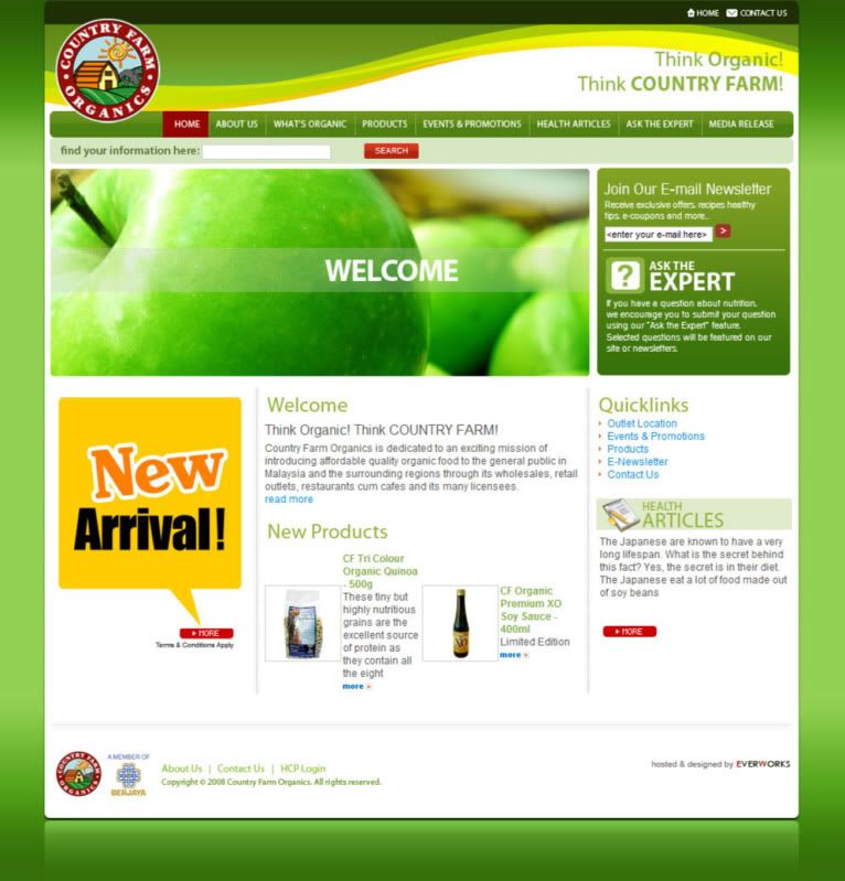
Primary: Country Farm
Secondary: General Nutrition Centers, Inc.(GNC)
Tertiary: McDonald’s, Kentucky Fried Chicken(KFC), Pizza Hut, Nando’s.
Moodboard & Sitemap
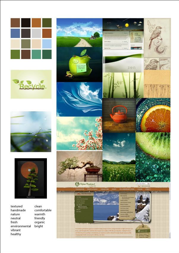
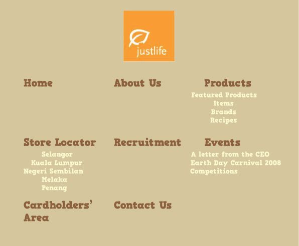
Click on images to view larger.