Wednesday, November 12, 2008

Blog updates...yay?

Tiring week....(Nothing new there.)

Sigh -_-' Anyway, I'm just going to give a quick update.

Below are the finalized Interface design for Design Method 1 - Project 2 (Visual Communication)

Enter Page
simplicity


Profile Page
simplicity


Portfolio Page
simplicity


Contact Page
simplicity

Weee...and below is my finished flash for Digital Media 1 - Save the Planet.
Credits to SoundDogs for music as well as sound effect and Alias for music as well.

The quality uploaded is terrible, so please bear with it. Thanks.

Over and out
-ruzy-

Wednesday, October 29, 2008

Profile Page of OrkidFa

Here come's the Profile pages. XD

simplicity

simplicity

To Glow or Not To Glow Sasuke? That is the question. XD Which do you prefer?
Does it feel like you're reading an online manga? Any feedback you have on the navigation style? the Readibility? The text flow? Much thank yous again for helping me out here people. XD

Over and out
-ruzy-

Monday, October 27, 2008

ACK! *Choke* *Choke* *breathe*

Thousands of apologies for not keeping this blog up to date like the other one. (Don't give me that 'no-hope' look. -_-' I know I'm guilty of not updating the other one as well la.)

Anyway, time to get rid of the dust bunnies, kan? XD

So, here I present to you...*Dusty drumroll* ORKIDFA! but NOT in the flesh! kekeke.

OrkidFa is created to represent the likes and characteristics of my client, Oh Keat Cher. By client, we mean a classmate la. The required art style? SIMPLICITY.

I chose to work with mainly 3 colours for the website; blue, black and white. It's the client's prefered colour as well as the colour of her favourite manga/anime character when he was first introduced into the series. Character: Uchiha Sasuke. The website was designed to look like an online manga.

Now, this is where I ask for you help. Please give comments, suggestions or feedbacks on the layout, typography, or ANYTHING at all regarding my design of the 'website'. Yeaps, it's suppose to be a website. One main page and 3 browsing pages. However, I will only be showing the main page for now. Okay? Much thank yous. *PS: Leave your comments at the comment section and NOT the tagboard yea?*


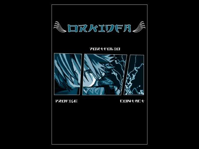
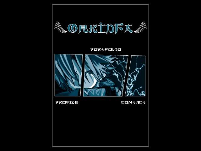
The difference between the images below is the image on the TOP has the layout on the enter page arranged higher compared to the one on the BOTTOM, which has a more centerised arrangement.


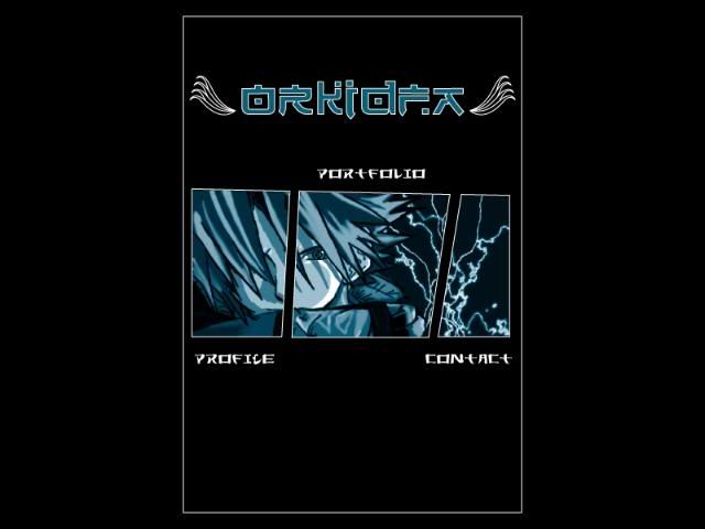
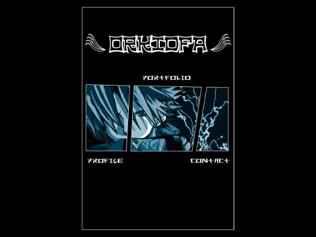
Rights, now for the typography. Which typeface do you prefer as the page TITLE? Do you think the typeface used as the links (profile, portfolio. contact) is suitable for the website? Does the typeface have a Japanese feel to it? (?_?)


simplicity

simplicity

simplicity

simplicity

Sunday, July 13, 2008

Loading pages.. muahahahah

interface
interface
interface

Please leave your comments at the comment section. NOT the chatbox? Thanks people.

Saturday, July 12, 2008

Project 2: Interface Design

interface,interface

No. It's not the finalised one. No, the character of my story does not look dat way, still in progress. ^^ Thought of posting up something before tomorrow. Sigh,  going for a walk now. The whole designing your own interface thing is fun and all, but its makes me very irritated when I don't get the effect I want. Dang ink. Oh and best of all the other day, I lost half my work. So its was back to 10% all over again. Damn technology. Yes, I did save my work, but it was no where to be found. Oh well, shit happens anyway.

-ruzy-

Friday, June 13, 2008

Final Design for Icons And Wallpaper

Greetings humans. Final icon design uploaded. Like, finally, right? XD It's been a week or two after the presentation. hahaha. I'm not a very enthusiastic blogger la. Anyway, I'd like to say a million thanks to all of those who have assisted me in my user-testing. (verbal ones, blog comment ones, MSN ones, etc.) Alrights, so below are my finals icon designs and wallpaper designs.


Vector Icons
Icon
Phone book/Contacts


Camera_Final
Camera


Ringtone_Final
Ringtone


Settings_Final
Settings


Icon
Wap


Pixel Icons
Icon
Clock Wise from top left: Settings, Camera, Contacts, Wap & Ringtone


Wallpapers
wallpaper
wallpaper

Monday, June 9, 2008

At The Circus Market

Welcome one and all to the circus market! *Insert circus music* Haha.

First of all I'd like to say thank you for visiting my blog.

As I've mentioned in my previous post, we've been given the task to create 5 mobile icons and wallpapers based on the theme 'fantasy'. Now before we are able to finalize our designs, we are required to user-test/test drive/pre-test our icons. (and maybe wallpaper too)

Having said that, I present to you, my icons!!! *bows*

Icon

Icon

Icon

Icon
(This is so dang fugly. I'm still in the process of redesigning it. Total makeover/plastic surgery.)

Icon
(There're two icons here but they resemble the same function and same vegetable/fruit. Which do you prefer? Left or right? Oh and I'm still experimenting with the shading/lighting and gradient.)


Q1) What do you think the icons best represent?
Q2) Were the icons easily recognizable?
Q3) What do you like most for each icons?
Q4) What do you have to say regarding the colours used for the icons?
Q5) What would be your suggestion for improvement?

Please leave your comments at the 'COMMENT' section. Not the tagboard ya? Thanks so much for your time people.

I'll be posting up my mobile wallpaper soon.

-ruzy-

Sunday, June 8, 2008

Mobile icons and wallpaper.

The idea was to create mobile icons and a wallpaper based on the given theme: fantasy. So things like faeries, dragons and ghosts immediately came to mind. Haha...
Fairy_Dancer
Fantasy Dancer by mjranum

Dragon & Unicorn
Fantasy by SnowSkadi

refs
Pepper Fantasy by sayda


However after doing the mind map, I wanted to base my icons on 2 ideas : hungry icon eating animals (particularly a certain bunny) or a zombified teddy bear.

doodlesdoodlesdoodlesdoodlesdoodlesdoodles
(more to come once I install my scanner >.<)

Those sketches were done weeks ago, although I feel as though its been months. Sigh...
Anyway, the real thing is FAR, far far far (it's so far you wouldn't believe its that far) from how I initially wanted my icons to look like. Preview:
Icon

I do not remember what happened to my bunny... *sniff* Rest in peace icon eating bunny
refs
ART BLOCK EVAIL BUNNY by BloodyKillOokami

I'll miss you.... *bites bunny* nyum nuym nuym....

The final icons are still under progress though. Many changes still needs to be done. Sigh. It's been tiring but fun none the less. ope it all works out in the end. I'm running out of time and my eyes are starting to juling. >.<

-ruzy-

*All refs used belong to various dA artists.*

Saturday, June 7, 2008

Colourful World

Voila! 10 colourful homemade templates. XD *bows*


template
Fire Dragon


template
Flower in the storm


template
Free me


template
Little dark girl


template
Morning


template
Poison Ivy


template
Quiet Day


template
Antique Sky


template
Dreams


template
Forgotten