CLICK ON IMAGE... ^^
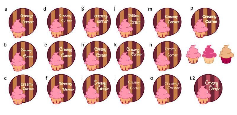
keekee~ *hearts* I really like logo designing....This is super fun~! ^^ Here I'm experimenting with the different typeface and also the different colour of the wallpaper in the circle. Please do comment ya~ ^^ If you prefer my other logos in my sketch (earlier post), please do tell me as well. I might redo my logo if i have the time. XD Thanks~
1 comment:
The logo a, e and i are the best among all. B looks more like u copied the cadbury's typography =D u can try changing the colours in the circle to a brighter tone? it'll look better
Post a Comment