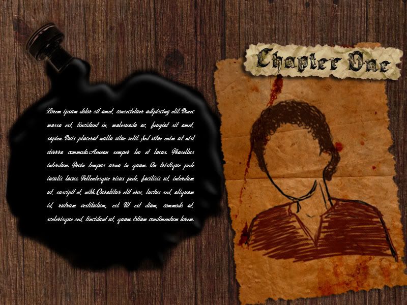
No. It's not the finalised one. No, the character of my story does not look dat way, still in progress. ^^ Thought of posting up something before tomorrow. Sigh, going for a walk now. The whole designing your own interface thing is fun and all, but its makes me very irritated when I don't get the effect I want. Dang ink. Oh and best of all the other day, I lost half my work. So its was back to 10% all over again. Damn technology. Yes, I did save my work, but it was no where to be found. Oh well, shit happens anyway.
-ruzy-
2 comments:
I like the woody effect because it makes it very Malay/Balinese/Indonesian like your story. It feels slightly creepy though maybe because the lady has no face (I know you're not done) maybe it's just the way it's sketched out but overall I like it.
Though I would suggest either increasing the font size or changing it into something easier to read because right now it's too small and too cursive.
You know, I tried to read the stuff on the inkspill and was scratching my head (oh noes, has my England gone kaput?) until I realised that it was some randomly generated latin nonsense XD.
But I digress.
I felt a disconnect between the font used in the chapter heading and the text. The text is kinda hard to read too. Maybe make it bigger or use something less cursive?
What is this for ah anyway? Feels like a mystery videogame XD.
We must make a horror game together one day. Deal?
Post a Comment