First of all I'd like to say thank you for visiting my blog.
As I've mentioned in my previous post, we've been given the task to create 5 mobile icons and wallpapers based on the theme 'fantasy'. Now before we are able to finalize our designs, we are required to user-test/test drive/pre-test our icons. (and maybe wallpaper too)
Having said that, I present to you, my icons!!! *bows*
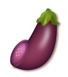
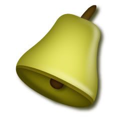
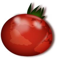
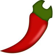
(This is so dang fugly. I'm still in the process of redesigning it. Total makeover/plastic surgery.)
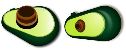
(There're two icons here but they resemble the same function and same vegetable/fruit. Which do you prefer? Left or right? Oh and I'm still experimenting with the shading/lighting and gradient.)
Q1) What do you think the icons best represent?
Q2) Were the icons easily recognizable?
Q3) What do you like most for each icons?
Q4) What do you have to say regarding the colours used for the icons?
Q5) What would be your suggestion for improvement?
Please leave your comments at the 'COMMENT' section. Not the tagboard ya? Thanks so much for your time people.
I'll be posting up my mobile wallpaper soon.
-ruzy-
8 comments:
1. I think the icons represent a communication technology for beginners type of program, the kind that belongs to kindergartens. Or maybe it is intended for people who like cutesy plushie things. Like the people who buy vegetable fridge magnets.
2. I immediately understood the 1st and 3rd one. The 2nd one I assume is a bell-pepper. The 4th looks like a spannar to me. The 5th makes me think of a mouse, or some other usb device. Or a button.
3. I like the first one because its shape complements the device it is supposed to represent nicely. I think the second one is a clever play on the bell-pepper - the name literally tells you what the icon is. The third one is cool because it has the glassy globe effect. The fourth I don't like, the fifth reminds me too much of the device used to summon nurses in hospitals.
4. I would have liked something a little brighter. Or maybe it should look a little shinier. I like the colours overall.
5. Fourth needs more work - can't tell what it is. Fifth one needs to be redesigned - keep the 2nd design but use the lens from the first, just make it bigger? And add a proper lens surface perhaps? Make the 1st one as shiny as the 3rd one? Make the top of the bell-pepper more rounded?
Hope it helps! I know I talk too much hahaha XD;;;
COMEL!
1.first one not sure.. ring style, web access, settings, camera
2.first a bit hard
3. the colour very suitable.
4. Good.
5. Make it clearer.. the shape. Dont' need to manipulate the vege.. can always add in some elements of real object to it..
I like the tomato :) I feel like eating it.. Cili needs to refine the shape...
camera circle circle thing bigger would be nice...
satu - they represents fruits (if avocado is counted as 1) & veges...
dua - all r easy 2 understand, with exception of d 4th & 5th, i noe its settings & camera bt d chilli & d avocado just don't look right.
tiga - like the matte-glossy effect on them, plus it something different compared to the boring super glossy effect tht most classmates applied..& d soft highlights... & most of all, it doesn't make my eyes bleed, haha..
empat - colour-wise, not bad, simple yet stil able to create d 3-dimensionality..tho seems to be inconsistencies on d chilli & avocado, compared to the other 3..
lima - as for camera/avocado, perhaps could come up with another idea, as d 2 examples is not consistent with d odr 4 in terms of orientation/angle & d lens, make it look more like a lens surface, it looks like a button now, needs more highlights & shadows, i think... & d 4th/chilli lost its shadow & d shape.design of d chilli needs fine-tuning..
thts all i could think of now..haha..cheers...
Hi Ruz, Wei Nye here :)
1) They all represent fruits/veges.
brinjal - not sure
pear/yellow pepper? - ring tone
tomato - web access
chilli - settings
avocado - camera (?)
2) I can't recognize the brinjal and avocado, which I suspect is the 'camera' icon, perhaps? I'm not sure.
3) I like the gradient and lighting for most of it. Very well executed unlike mine :'(
4) I like the colours though I'd prefer it to be of brighter colours as well. But overall, I like it.
5) Maybe you could modify the avocado a little but I like the avocado colours the most. Besides that, I think everything's fine the way it is.
6) Comment on mine? :)
Thanks, see ya on Wednesday.
??
is this the latest??
awkao..tot dun wan chilli?
pro..hahas..nice..gud luck in presentation..
hey ur bro asked me to help give feedback.. so here's some?
1) personally i find that fruits and veggies with technological aspects fused with them somehow bring across agriculture. the 1st 3 especially. for the last 2, sorry, chili looks jus lie chili.. and the last one is wat? missile launch button? sorry =x
2)the 1st 4 were easily recognizable... the last one... still looks like a missile launch pad with a big button.
3)wat i liked most about the icons was the lighting and shading.. very nicely done. and oh, i like how the subtle aspects of other objects are mixed in very nicely, very clever. except for the chili (cuz it still looks like a chili) and the missile launch pad.thats pure technology!
4) well depicted and accurate. eye catching. perhaps the earth/tomato coulda had blue? to have it more "earthy"... maybe another fruit or sth... i dunno, use ur imagination =)
5)the 1st 3 are alrite.. jus a personal opinion, if u'd like to have the earth fused with something, i recommend blue... the chili needs to have sth fused with it unless u want it to remain a chili... and the last one.. i still dunno wat missile launch pads have to do with fruits and veggies.
pris is here babeh!!
x).
1.The little icons in your phone.
2.first one and tomato very the clear.tapi leh the chili and the other ones not so clear...
3.kaka,i like the tomato.how i used it to portray web.oh eh.did u c the tomato/orangey thingy in K1 class?funny thing.the terung aso fascinating.but chili needs to go to hospital.T.T.and i dun really get the last one.
4.colors are appropriate.(make bell bell a bit more happy vibrant!x)!)
5.for blur people(like me)can't really get it at a glance,referring to the bell and the chili and the last one.if you could add or modify it to represent more of it's function or related to it's function.and also if possible a sense of like identity for all(same angle ka,same dimension ka,etc)to show like they belong together.other than vege and fruits.but as always,easy to say hard to execute.T.T.
(for the green thing i like the one on the right more.x))
ALL THE BEST!!!
ruzy, its me Pern! :D just want to conteng here and im going to link u in my new blog. hehehehe.
Post a Comment